ROLE
Led UI/UX Design
COLLABORATION
UXR, PM, Eng
SKILLS
Visual Design, RITE Testing, Design Systems
BACKGROUND
Pathways is a platform where students can browse and enroll in co-curricular classes ranging from "self-paced" (asynchronous) 3D printing tutorials to "live" (in-person) pottery workshops. The site also offers collections of live and self-paced classes on specific topics called "pathways." It came about as a way to centralize the vast amount of co-curricular/ extracurricular offerings from different departments on campus.
Our team conducted research with students and found that while students loved the idea of the site, the flow to find/ enroll in classes that fit both their preferences and schedules took too long.
problem
⏱️
User feedback revealed that students felt the process of finding and enrolling in classes took too long on the existing Pathways interface
BEFORE REDESIGN
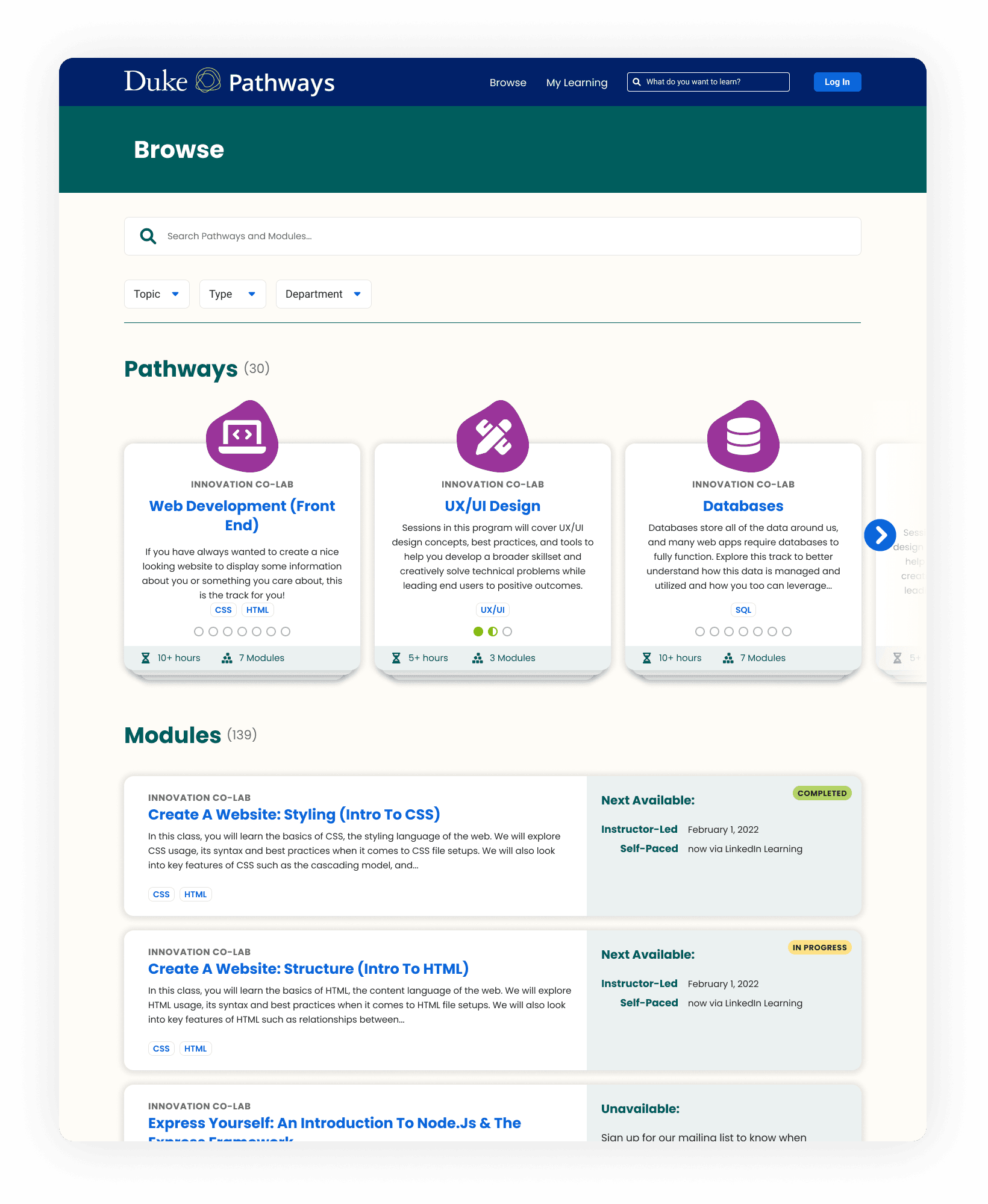
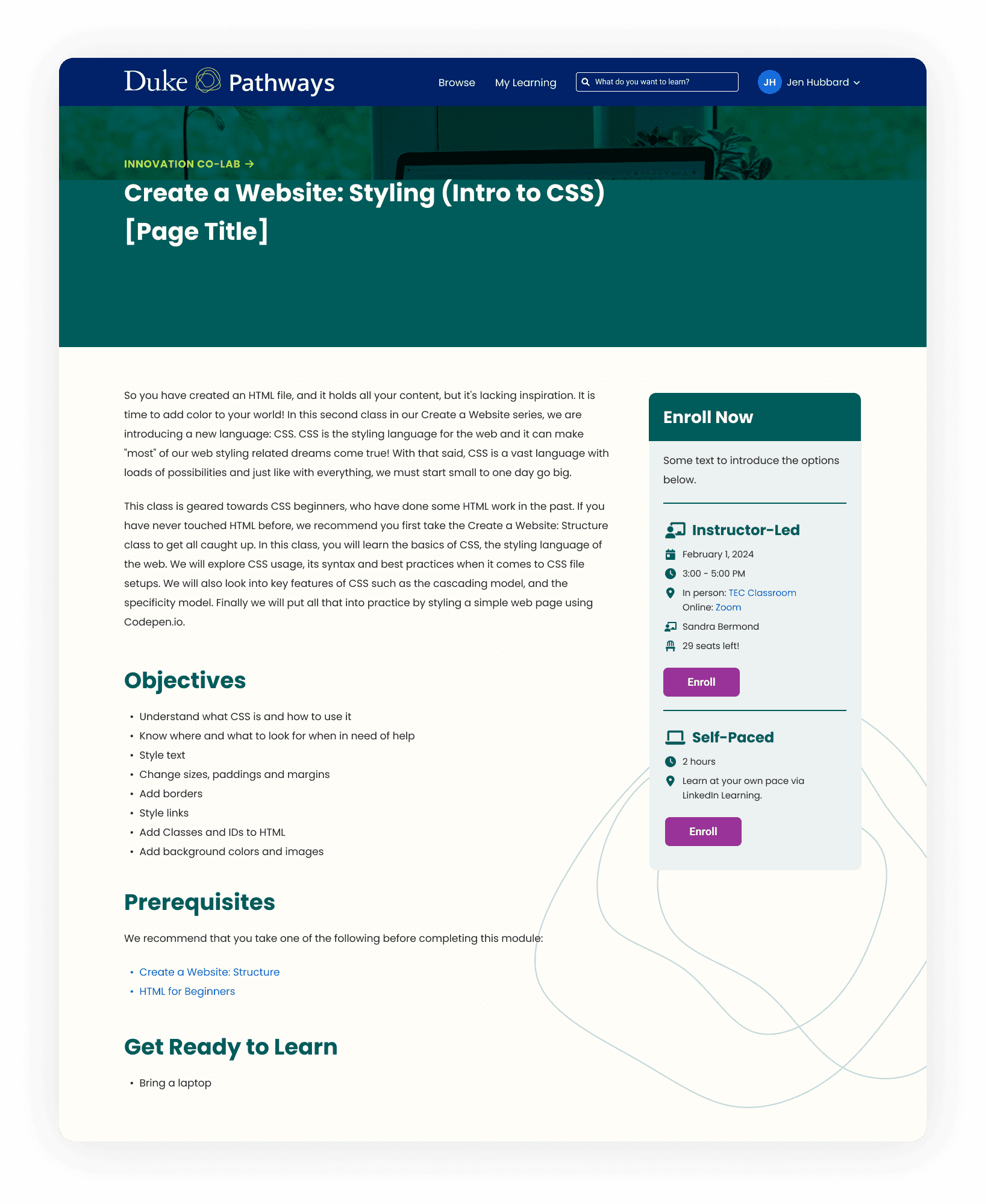
To enroll in a class, students had to navigate to the browse page -> scroll through a long list of pathways, live, and self-paced classes -> click on a class that might fit their schedule -> click on enroll from the class page
The flow took 3 screens, 4 clicks, and lots of scrolling.


Scroll to view Pathways before the redesign
REDESIGN GOALS
goal 1
⏩
Create a faster flow for finding and enrolling in classes
goal 2
🧐
Reduce cognitive load for determining schedule fit for live classes
goal 3
👀
Create a scannable filter interface that is intuitive to use
goal 4
📱
Ensure the user experience is positive on all device types
RITE TESTING
On the surface, this seemed like a pretty simple project. However, once I began peeling back the layers and coming up with potential design solutions, I realized there were what felt like a million directions we could go.
For this sprint, we tested out Rapid Iterative Testing & Evaluation, which it ended up being extremely effective for addressing the many design possibilities. We tested mid-fidelity mockups with a few users and if more than one person ran into the same issue or had similar feedback, we would adjust the mockups right away before testing with the next set of users.
After just a few rounds, we were hearing lots of positive feedback from users and could tell we were on the right track.

Initial sketches for Pathways home and browse pages in Figjam
SOLUTION 1
Creating a faster flow for finding and enrolling in classes
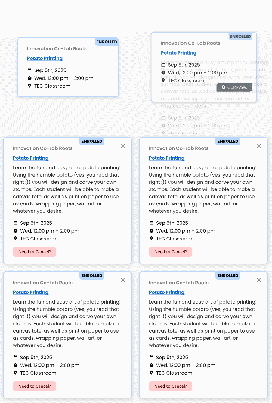
Not only did we introduce a calendar view to the browse page so users could quickly scan and find classes that fit their schedules, but we also put a preview of it on the landing page of the site. Additionally, after a few iterations on the card design, we landed on one that allows users to enroll from whatever page they are on, without having to click into the class page.
Users can now enroll in upcoming live classes in just 2 clicks.

Calendar view is right on the landing page for quick access

Users can enroll/ cancel from the browse or landing page
SOLUTION 2
Reduce cognitive load for determining schedule fit for live classes
During interviews, some users preferred a calendar view and some preferred seeing all classes at once in a grid view. I added a view toggle so users can browse in the way that suits their needs.
Interviews also revealed users usually had a preference for live vs self-paced classes. Students who wanted to take live classes weren't interested in self-paced classes and vice versa. For this reason, we tested out a tabbed view with live classes being the default, which students responded positively to. This also solves the issue of mobile users having to scroll past a long list of Pathways cards to view live and self-paced classes.

Browse page calendar view
SOLUTION 3
Create a scannable filter interface that is intuitive to use
Topic filters used to be a jumbled, unordered list with overlapping topics. Also, users had to click the class type and department drop downs for further filtering instead of seeing all filter options at once.
The new design features an all-in-one filter sidebar where users can view all filter options at once (less clicks!) along with a trimmed down topics list.

Browse page with filters
REFLECTIONS
I really enjoyed working on this project because of how fast we were able to test and iterate on designs until we found something that worked for a wide range of users. While the large scope presented its own challenges, it made releasing the final redesign even more rewarding.
If I could go back in time, I would love to measure how long it took for each user to find and enroll in a class using the original design. While it's clear we saved users clicks and screens, it would be helpful to know just how many seconds the new design saves users per class enrollment.

Made with ☕︎ & ฅ^•ﻌ•^ฅ cuddles
(using Framer, ChatGPT, Procreate)