ROLE
Led UI/UX Design
COLLABORATION
UXR, PM, Eng, Marketing
SKILLS
Visual Design, Usability Testing, Design Systems
BACKGROUND
DukeMobile is a campus app for Duke’s ~18,000 students that serves as a centralized source of services and information. In 2017, the app was redesigned to be "map-first" because analytics showed that users were spending most of their time using the map service. Fast forward to 2023, our team's UXR conducted 40 user interviews and found an overall negative sentiment towards the app, which kicked off a new redesign effort - this time based on user research and not just analytics.
user problem
😠
Students couldn't find what they needed in the app and were overwhelmed with the long list of services
business problem
📉
This sentiment led to poor retention rates as students would delete the app soon after downloading it
“There’s a lot of valuable information but the list is so long. I don’t know what all of this is, and I don’t want to sit here and figure it all out.”
- Student during pre-redesign testing
BEFORE REDESIGN
Many students thought the app was just the map despite there being other features available. When they did find the menu options, they were overwhelmed by the long list and didn’t recognize what some of the services were.

REDESIGN GOALS
goal 1
🔎
Make app features more discoverable
goal 2
🎮
Give users more control
goal 3
👤
Make the app more user-specific
goal 4
📲
Native integration of existing services
CHAPTER 1
Making features discoverable

Initial sketches for DukeMobile
After I mocked up ideas that aligned with our redesign goals, we put prototypes in front of users to get feedback early on, which eventually led us to the designs below.
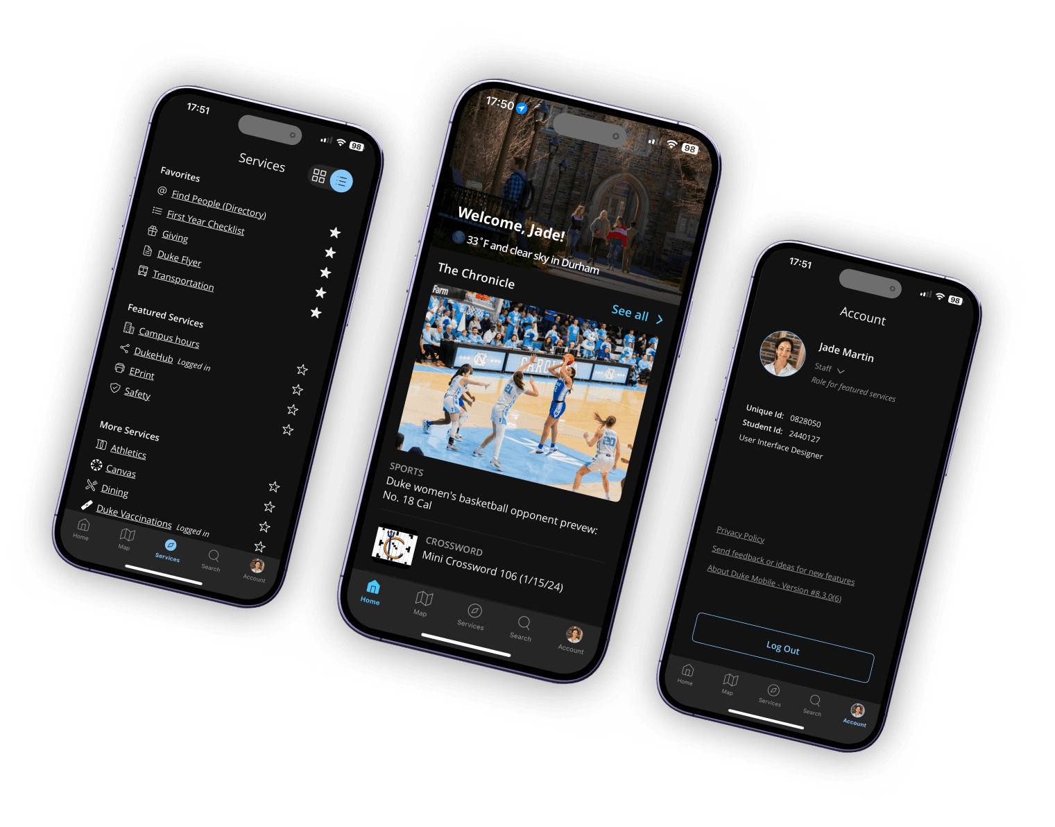
Five tabs allowed much more real-estate to pull high-value features out from behind the long service list on the old design. All of the new content sections on the Home Tab used to be icons behind a hamburger menu. We also added a search tab so users could quickly find what they needed without having to recall where it was in the app.


Scroll through the five tabs above
CHAPTER 2
Giving users control & personalization
Students complained that the list of services was overwhelming, so we wanted to somehow call out services that a certain affiliation would be more likely to need. While my first instinct was to just pull affiliation from user data, I learned from our UXR that some users have dual-affiliations (such as student/staff), so it was more fool-proof to have users select their primary affiliation and then give them the option to change it as needed. Apart from featured services, we also gave users more control through the ability to rearrange or hide content sections on the Home Tab.
As for personalization, I designed a new section on the Account page where students can quickly access their important campus IDs and account balances. I also had the idea to personalize the hero section on the Home Tab with a welcome message and the current weather on campus. This added a small moment of delight that many users mentioned positively during usability testing.

A user's affiliation selection curates featured services

Users can rearrange or hide sections on the home tab
CHAPTER 3
Visual refresh
Even though I was redesigning existing services for the most part, I had to create components from scratch since they previously existed as icons in a list. I built a new design system in Figma, collaborating closely with the engineers to ensure a smooth handoff.
I also added a dark mode using variables in Figma as suggested by Duke's Sr. Web Accessibility Administrator for users with visual impairments, migraines, or anyone who prefers to use their phone in dark mode.

Home Tab section components designed from scratch

Dark mode designs for accessibility
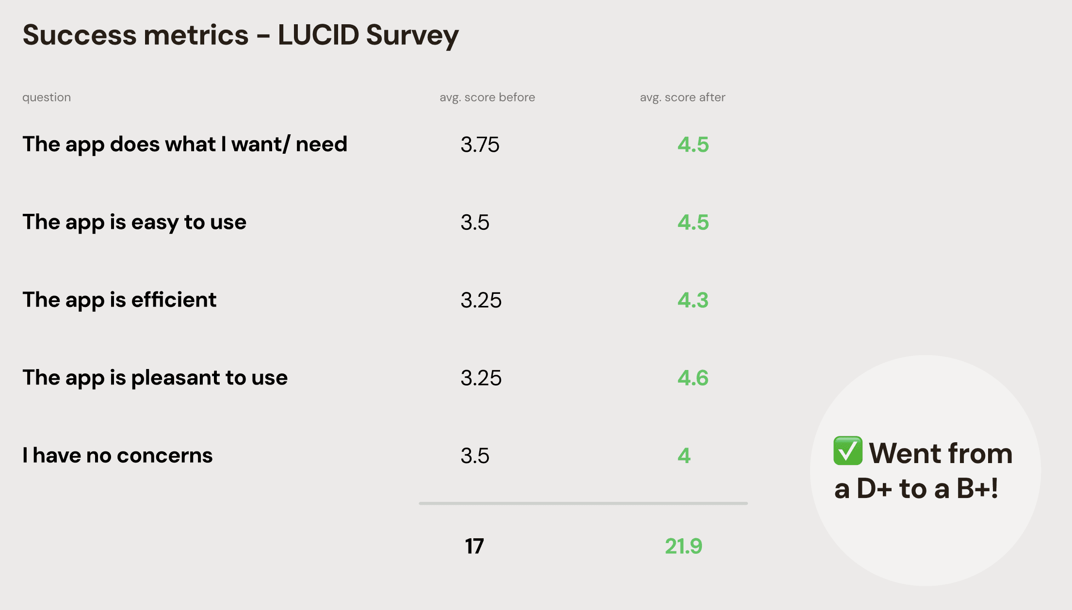
IMPACT
Before the redesign, students were getting frustrated with the app experience and deleting it after just a few weeks on campus. Now, user satisfaction has increaed 30% since the redesign
and users are very happy to tell us:
“It's simple and easy to find needed information.”
“I think there are several functions that I would utilize like the map and the events.”
“The search feature was easy and seamless. I typically use the app for maps, but other features are quick and informative.”
- Students during post-redesign testing
REFLECTIONS
Through the redesign, I learned about the power of small delightful moments. Minor things like personalizing the hero on the Home Tab brought a smile to users' faces during usability testing which was awesome to see. It made me want to find more ways to incorporate these moments whether through graphics, copy, or interactions.
I also learned that analytics may say what users do, but they don't explain why they do it. The DukeMobile team had great intentions when redesigning the app to be map-first in 2017. They thought they were giving users what they needed. However, this ended up creating more of a problem than it solved. While analytics can be helpful, user interviews are necessary to truly understand user needs and expectations.

Made with ☕︎ & ฅ^•ﻌ•^ฅ cuddles
(using Framer, ChatGPT, Procreate)